Showing posts with label design. Show all posts

Thursday, February 17, 2022

The American Drawing Book: Learning to Draw Like an 1840's Amateur

Like an antiquities thief eyeing his next score, I often treat a museum visit as a sort of shopping trip. Instead of looking for my next heist, I'm on the lookout for ideas and inspiration. This last trip to the Smithsonian was no different. One gem I walked away with is featured in this pic:
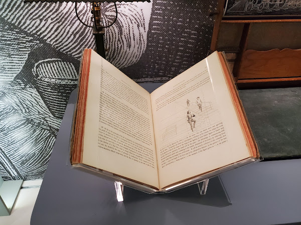
According to the associated plaque, that's a copy of the The American Drawing Book: Manual for the Amateur, Basis of Study for the Professional Artist by John Gadsby Chapman. Published in 1847, as the title suggests, this text was intended to teach both amateurs and pros how to draw.

Thanks to Google Books we need not admire the text through glass alone. You can download a PDF or read the book online.

I've been making my way through the text,  and have spent enough time with it to form an opinion. Like any modern drawing book, the introduction dwells on the many benefits of learning to draw. The 'American' in the title is emphasized in the introduction, because at the time the text was published Europe was the center of the design universe. America had quite a bit of catching up to do, and Chapman intended to assist by providing this text for use by all, from the humble public student to the eager professional.

Among the groups of people he encourages to pick up the pen are women.

There are those, of another class of society, to whom education in Drawing may prove a real blessing whose painful and ill-repaid labors, to earn a scanty provision for themselves and families, have so often called forth our sympathies; and, while public feeling loudly declaims against the evil, no efficient remedy has been applied. Of the thousands of dependent females who are compelled to toil, night as well as day, to the destruction of health and life, and who are often tempted into paths of vice and misery by absolute necessity, how many there are who possess talent that needs but cultivation to secure them both respectability and support. The natural refinement and delicacy of the female mind renders it a fruitful soil, that should not be neglected or let run to waste, when its cultivation might realize such rich advantages, not only to themselves, but to their country. Give them the advantages of education in Drawing ; begin in your public schools let them carry it to their looms, to the manufacture of articles of taste and fancy, to their firesides, to the early education of their children;—-and more, if they possess the talent,—-let them take the pencil, the chisel or the burin. Give them strength, by proper education, to feel what they can accomplish, and we shall soon see the broken-hearted victims of incessant toil worth the wages of men, in departments of industry and usefulness for which they are by nature so well adapted.

Surprisingly woke, no?

I also appreciated his appeal to parents who may consider drawing to be a frivolous waist of time.

Fathers and Teachers--call not your boys idle fellows, when you find them drawing in the sand. Give them chalk and pencil — let them be instructed in design. “But,” you say, “I do not want my boy to become an artist.” Depend upon it, he will plough a straighter furrow, and build a neater and better fence, and the hammer or the axe will fit his hand the better for it: for from it, no matter what may be his calling in life, he will reap advantage. Last, not least, you give him a source of intellectual enjoyment, of which no change of fortune can deprive him, and that may secure his hours of leisure from the baneful influence of low and ignoble pursuits.

While the text may be written in awkward language, I can't think of strong arguments for why someone should learn to master the arts.

Chapman clearly had his advocacy game down. But how about the core of the text? Does the drawing instruction hold up? I'm only part way through the book, but so far, I'd say Chapman is nailing it.

Consider this advice he offers about favoring a pen over a pencil and an eraser:

Let us lay well the foundation, before we begin the structure. He who starts with the black lead pencil in one hand, and the Indian rubber in the other will find, however convenient the latter may be, that he will soon fall into loose and slovenly habit, of which it will be difficult to divest himself. They are both good and serviceable in their places; but too often, in the hands of beginners, most sadly abused.

This mirrors contemporary advice I've read on the topic.

So far, Chapman has focused on drawing progression. I've been faithfully following each of his exercises, which started as simply as tracing lines created with a straightedge. I'm finishing exercise #17 which has me drawing simple objects and using a grid to help navigate where the lines should be placed.

The grid vastly simplifies the drawing process, and I was impressed at Chapman's choice to rely on it. It then occurred to me: what if I wrote some code that let me take any pictures and draw a grid over it? That would be one useful tool, I mused. I could take Chapman's strategy from the 1850's and bring it to my 2022 smartphone! As a precursor to writing the app I had in mind, I searched Google Play for a similar topic. Turns out, there are quite a few apps that do exactly what I had in mind.
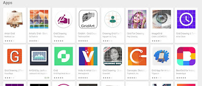
Apparently, overlaying a grid on a picture to help draw it is standard practice. Chapman knew this is 1840, and artists know this today. I'll take this as a hint that Chapman's drawing advice is standing the test of time, and more importantly, I have a lot to learn.

Here's a few samples of the work I've completed. I look forward to seeing if Chapman's approach continues to be effective.

Friday, February 11, 2022

The Valentine's Gift a Year In The Making

Last Valentine's Day I gave my wife what every young lady dreams of: an over-engineered Love Note Display and Archival System. For the past year I've been feeding it messages for her to see, as well archive for later use. With Valentine's Day around the corner, it was time to put the stored content to use.

One thoughtful gift, I imagined, was to take messages I'd sent and format them into a poster. While I have no problem writing code that let's me post love notes from an Android device to an iPad, the thought of designing a poster left me overwhelmed. In fact, I considered outsourcing the job to someone on etsy. Still, in the name of love, I figured I should at least make an attempt.

A Little Gimp

I decided to start simple. I launched Gimp and made a new 4000x5000 pixel image. I chose this image size because it seemed both large, and has the same aspect ratio of an 8x10 photo.

One tricky aspect of this project is that some of the love notes contain emojis. While they looked good when rendered on the iPad and even stored properly in the Google Sheet, I had my doubts that they would format properly in Gimp. I selected all the notes from a Google sheet, copied them to my clipboard, and pasted them into a large text area in Gimp.

To my amazement, Gimp seamlessly rendered the text and emojis.

While the notes were all there, I didn't have anything resembling a pleasing poster.

A Little Shell Scripting

My next move was to reformat the text so that it was no longer one message per line. I made one massive stream of text using this quick shell script. I'm separating each note with \u2764 which is the heart emoji.

#!/bin/bash

##
## take in an input stream of love notes and output formatted love notes.
##

while read line ; do
  echo -n "I Love $line"
  echo -e -n " \u2764 "
done

The screenshots below show another discovery: Like Gimp, Windows Terminal running Ubuntu on WSL 2 seamlessly handles emojis. I'm so leveraging this in the future by having my shell scripts print out emojis status messages. While I was at it, I installed emojify, an emacs package that let's you seamlessly use emjojis. I can't wait to start including emoji's in my git commit messages.

I copied the massive line of love-note text into a Gimp text area and told Gimp to justify it. It looked better. We were definitely getting somewhere.

A Little More Gimp

To polish this up, I headed to Google photos and found a meaningful picture I could use as the poster's background. I downloaded it and positioned it at the bottom of my creation.

I then faded the top part of the background image using a layer mask. This allows the photo to seamlessly flow into the background of the poster.

I then dialed down the opacity of the background pic so it would be more reader-friendly and picked a color other than white to use for the poster's background.

And that was it, in relatively short order, I had my completed poster.

Success!

My final move was to send the image off to CVS to have it printed. $4.00 later, I had my Valentine's gift in hand. I have to say, I was pretty floored by how well the project turned out.

Mind you, the poster is far from perfect. At 8x10, the text is far too small to casually read, and the background I selected was probably too dark. Still, from an art perspective, it sort of works. You look at this 8x10 picture and see a mess of text. It's only upon closer inspection that you realize what you're truly looking at. So yeah, let's call this abstract art and leave it at that.

Tuesday, January 25, 2022

Fighting Finicky Frames; Perfectly Printing Pics Programmatically

A few months ago, Shira picked up a couple of these photo-cubes with the plans to turn one into a gift:

Each side of the cube holds a 2.5x2.5 inch photo with only 2x2 inches visible. The challenge became: how can I prepare a series of pictures such that when they are printed, they will output as 2x2 inch photos on 4x6 inch paper.

Let's Do Some Math

Here was my approach: crop the pictures that Shira liked into squares. For the sake of an example, assume that each of the pictures are 1382x1382 pixels. Using a little algebra, I solved for the pixel width and height of the completed 4x6 photo:

# Derive the width
2 inches         6 inches
--------     =  ----------
1382 pixels      w pixels

2w = 6*1382
w = (6*1382) / 2
w = 4146


# Derive the height
2 inches         4 inches
--------     =  ----------
1382 pixels      h pixels

2h = 4*1382
h = (4*1382) / 2
h = 2764

Within Gimp, I resized the canvas of each of the photos to the calculated dimensions (4146x2764). We then sent off the pics to be printed and cut away the whitespace until the images fit the fame. The final product looked great.

Since then, I've been staring at the backup photo cube Shira bought and thinking: I really need to automate this process and try printing the photos again.

Along the way, while visiting the kids in Florida, G showed me a locket that she'd 'borrowed' from her Mom. It was pretty, but was missing the photo inside. I took pics of its dimensions and vowed I'd get her a photo that would fit. I realized, this was just another version of the photo-cube problem:

Let's Code This

I pondered a few different solutions to this image manipulation problem and arrived at a simple approach. My plan was to write a shell script that used ImageMagick to do the following:

  1. Calculate the requested aspect ratio of both the final size (2x2 inches) and the provided photo (1382x1382), and confirm that they match.
  2. Calculate the conversion factor: 1 inch = x pixels based on the pixel size of the input photo and the requested output size.
  3. Use ImageMagick's convert tool's -border option to pad the image with extra space.

For example, here's the command I used to convert a directory full of square photos for output as 2x2 inch photos printed on 4x6 inch paper. The -b option added a .25 inch border around the photo, which makes it easier to trim. This .25 inch border means that each photo is now 2.5x2.5 inches, the frame's advertised size.

$ for f in inputs/*.jpg; do echo $f ; picassist -a prepare-print -W 6 -H 4 -w 2 -h 2 -b .25 -f $f -o outputs/$(basename $f) ; done
inputs/20190715_130759.jpg
inputs/20190716_073107.jpg
inputs/20210802_071223.jpg
inputs/20210803_102944.jpg
inputs/20210805_191843.jpg
inputs/f_img_4832.jpg

And here's the same command, but now I'm preparing the images for printing on 8.5x11 inch printer paper at home. Note that I'm still generated 2x2 inch photos with a .5 inch border.

for f in scaled/*.jpg; do echo $f ; picassist -a prepare-print -W 8.5 -H 11 -w 2 -h 2 -b .25 -f $f -o 8.5x11/$(basename $f) ; done
scaled/20190715_130759.jpg
scaled/20190716_073107.jpg
scaled/20210802_071223.jpg
scaled/20210803_102944.jpg
scaled/20210805_191843.jpg
scaled/f_img_4832.jpg

I used the same strategy for making prints for the locket. As far I can tell, the dimensions of the locket are 0.6875x0.9375 inches. I added a 1/16" border around them:

 picassist -a prepare-print -W 4 -H 6 -w 0.6875 -h 0.9375 -b 0.0625 -f scaled.jpg -o output.jpg

Picture Perfect. Almost.

I sent a series of photos to CVS to be printed. When I picked them up a few hours later I was disappointed to see that the images were about 2/16" off. Something must be getting scaled unexpectedly in the process. I printed the photos on my laser printer, and found similar results. Both the gray border and picture are a couple of 16ths off.

Undeterred, I went to work trimming the photos and sliding them into the cube. Even with the dimensions being slightly off, the photos do look good:

I'm going to call this a success. I was able to prepare the photos, send them off to a printer and trim them with minimal effort. Wacky frame sizes, I no longer fear you!

Below is the script that does the image tweaking. Enjoy!


#!/bin/bash

##
## Do useful stuff with photos
##

usage() {
  me=$(basename $0)
  echo "Usage: $me -a prepare-print -W outer-width -H outer-height -w inner-width -h inner-height -b border-width -f img.jpg -o out.jpg"
  echo ""
  echo "Ex: $me -a prepare-print -W 6 -H 4 -w 1.5 -h 1.5 -b .2 -f img.jpg -o final.jpg"
  echo "  (print a 1.5x1.5 inch photo on a 4x6 in print)"
  exit 1
}

action=""

while getopts "a:W:H:w:h:b:f:o:" o; do
  case "$o" in
    a) action=$OPTARG ;;
    W) outer_width=$OPTARG ;;
    H) outer_height=$OPTARG ;;
    w) inner_width=$OPTARG ;;
    h) inner_height=$OPTARG ;;
    b) border_width=$OPTARG ;;
    f) file=$OPTARG ;;
    o) output=$OPTARG ;;
    *|h) usage ;;
  esac
done

calc() {
  echo "scale=3 ; $* " | bc -l
}

im_id() {
  identify "$@"
}

case "$action" in
  prepare-print)
    if [ -z "$outer_width" -o -z "$outer_height" -o -z "$inner_width" -o -z "$inner_height" -o -z "$border_width" ] ; then
      echo "Missing W, H, w, h or b."
      exit 1
    fi

    if [ -z "$file" ] ; then
      echo "Missing -f file"
      exit 2
    fi

    if [ ! -f "$file" ] ; then
      echo "File [$file] doesn't exist"
      exit 3
    fi

    if [ -z "$output" ] ; then
      echo "No output file set."
      exit 4
    fi
    
    real_width=$(im_id -format '%w' $file)
    real_height=$(im_id -format '%h' $file)
    
    required_ratio=$(calc "$inner_width / $inner_height")
    real_ratio=$(calc "$real_width / $real_height")

    if [ "$required_ratio" != "$real_ratio"  ] ; then
      echo -n "Ratio mismatch: require ${inner_width}x${inner_height} (${required_ratio}) != "
      echo    "${real_width}x${real_height} (${real_ratio})"
      exit
    fi

    px_per_real=$(calc "$real_width / $inner_width")

    border_px=$(calc "$border_width * $px_per_real")

    h_margin=$(calc "(($outer_width - $inner_width - ( $border_width * 2)) * $px_per_real) / 2")
    v_margin=$(calc "(($outer_height - $inner_height - ( $border_width * 2)) * $px_per_real) / 2")

    convert  $file \
             -bordercolor gray -border $border_px \
             -bordercolor white -border ${h_margin}x${v_margin} \
             $output
    ;;

  *) usage ;; 
esac

Friday, January 21, 2022

Hidden in Plain Sight: The Butt Millet Memorial Fountain

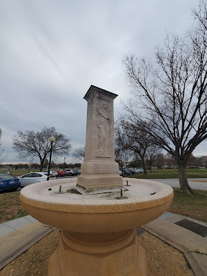
A few weeks back, Shira and I were walking through DC and found ourselves perusing the National Christmas Tree display. Nearby, I saw the familiar Zero Milestone. I also noticed a tired looking fountain-statue-thing that I'd never really taken note of before.

A bit of research confirmed that I'd found the Butt Millet Memorial Fountain. While it may be obscure, it's worth getting to know.

Here's 4 fascinating facts about this easy-to-miss memorial.

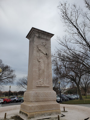
1. It's a memorial that honors an early DC Bromance. The memorial honors two men, Archibald Butt and Francis Millet. Butt was a well known soldier; Millet an accomplished artist. While Millet was married, his wife lived out of town and Butt and Millet lived together, having a reputation for throwing lavish parties. Were they more than best buds? Even the National Park Service takes the time to note that while Millet was married he had several same-sex relationships in his lifetime.

2. Butt was a close friend to both Presidents Roosevelt and Taft. Notably, Taft considered him like a brother. Taft was so moved at his funeral that he broke down during Butt's eulogy and had to be led from the podium in tears.

3. Butt and Millet died together during the sinking of the Titanic, and the memorial makes a nod to this. These weren't merely two anonymous passenger who happened to be lost during a well known tragedy; their loss was front page news.

A day after the sinking of the Titanic, it was wrongly reported that Millet and Butt were both safe. Within 10 day of the sinking, there were already legends being published that Butt courageously helped with the rescue. While these legends have never been confirmed, it didn't stop the creator of the memorial fountain from incorporating them:

The central shaft [of the fountain] will reach a height of twelve feet. It is of classic design. Upon one fact it will bear and armed female figure, in bas-relief, representing Chivalry, having reference to Maj. Butt's aid to women and children on the occasion of the disaster in which he met his death; on the opposite face will be a similar figure representing Art, having special reference to Mr. Millet.

4. The memorial may (but probably didn't) have had a functional purpose. When I read this description of the Butt-Millet Fountain, I thought I'd connected some important dots:

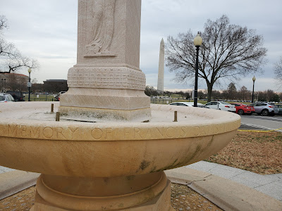
On the south, a man with a helmet, sword, and shield represents military valor in honor of Butt. The fountain was designed to be used as drinking water for horses of the U.S. Park Police, but don’t imagine it is still used this way.

The idea that the memorial doubled as an equine drinking fountain is both clever and may explain its shape. And yet, I can't find any evidence to suggest this claim is true. Sure, the bowl of the fountain looks to be an at an ideal height a horse to take a drink; and it may have served that purpose on occasion. But, the description of the fountain when it was built neglects to mention this use. As late as 1934 there are descriptions of Washington, DC having purpose built horse drinking fountains. If such fountains existed, why make that part of a memorial?

In retrospect, the idea that you'd combine a memorial for two of DC's well known citizens who were tragically lost in a epic disaster with a place for horses to catch a drink seems pretty ridiculous.

Still, given the shape of the fountain, I can see how an urban legend like this would thrive.

Wednesday, January 19, 2022

DC's National WW I Memorial, Incomplete and Worth A Visit

A few weeks ago Shira and I were traipsing through DC when we stumbled upon the National World War I memorial. This was surprising as I had no idea DC had a such a memorial. Apparently, until recently, we didn't. The location is a sort of expansion of Pershing Park, which has been in place since the 1980's and honors General Pershing and the 2 million(!) members of the American Expeditionary Force he lead during World War I.

Eventually, I'd find myself standing in front a plaque that would explain the in-progress nature of the memorial. But before I did, I found myself face to face with A Soldier's Journey, a massive mural that attempts to capture the soldier's experience during World War I.

I was taken aback by the choice of using a rough sketch to capture the scene. But at the same time, it worked. As I stared at the mural in front me I struggled to square the simplicity of materials and techniques with the awesome emotive power that it brought to bear.

As I looked closer, I realized that this wasn't just a rough sketch. It was a rough sketch done on a tarp like material that was then bolted into place.

What?

A plaque at an elevated position in the memorial cleared up the confusion. A Soldier's Journey is going to be bronze statue; the rough sketch is a temporary place holder.

I'm sure the completed bronze relief will be impressive. But I'd recommend stopping by while the sketch is in place. I'm telling you, there's something magical about watching something so simple say so much.

Friday, January 07, 2022

SaSaS #1

We start this first edition of the South Arlington Stick Art Scene with some bad news. Arguably the soul of South Arlington's sticker art scene was the utility poll outside of Bob & Edith's Diner. Over time, this post accumulated a delightful collection of stickers. For those paying attention, passing by was like encountering a public art exhibition.

Alas, some thoughtless soul took a bottle of black spray paint and turned this cooperative art scene into an eye sore. Why? I can't imagine.

In happier news, I was psyched to spot a couple of 'Art Is Dead' stickers while running last week. It's quite possible these were ordered off the web and randomly slapped up to mar public property. However, I'd rather believe this is the work of the same artist who made a statement by covering a bridge in Sherlock stickers. I'd seen the 'Art is Dead' sticker with the text lined up vertically before, but this was the first time I've seen the letters lined up diagonally. I'm interpreting this as the artist continuing to tune his or her work, which I suppose is the complete opposite of the 'Art is Dead' message of the sticker. Well played anonymous artist, well played.

Finally, here's a new favorite sticker I came across a couple of weeks ago. This one isn't located in South Arlington, it's across the bridge in DC.

I know what you're thinking, that's a QR code--big deal. Except, it's not. It looks like a QR code, with the checkered pattern and distinctive black-outlined rectangles in the corner, but if you try to scan the sticker with your phone, no QR code is detected.

Looking at this page which describes how QR codes work, it's still not clear to me what the above image is lacking to be detected as a valid QR code. I can see the Finder Patterns and Timing Patterns clearly enough. But still, it doesn't work.

Granted, the most likely explanation for this 'sticker' was that the poster intended it as a working QR code. The fact that it doesn't scan is almost certainly accidental. It's also possible that some kid intentionally posted this QR-looking code simply to mess with tourists.

However, like the 'Art Is Dead' hypothesis above, I'd like to imagine that this sticker slap is an artist's statement. What looks like urban visual detritus is actually something more. It's not an ad for a company or band; but a hidden-in-plain sight piece of art that you expect to behave one way, but behaves another.

As far as I'm concerned, this humble "QR Code" could easily live in the Hirshhorn Museum, among other clever and subversive pieces of art.

Monday, May 24, 2021

Street Art for All, without Asking

Art in public spaces is great. It's also tricky. Getting permission means dealing with layers of bureaucracy. Asking for forgiveness risks criminal prosecution and possibly marring your neighbors space.

I came across a brilliant solution to this problem on my run over the weekend. I give you the Secret Community Mural.

The 'mural' is tucked away under a bridge, visibile only to walkers and bikers. It consists of drawings, messages and most importantly, a bag of chalk for passer-bys to add their own.

This citizen powered project can risk asking for forgiveness because the artwork isn't permenant and it's only going to improve the surroundings. So clever, so brilliant.

Here's where the mural is located to stop by and contribute:

I've been trying to think of a way of supporting this project. I suppose I could drop off more chalk. Though I'm considering placing an Ed Emberly Drawing Book at the location as a source of inspiration. Have any better suggestions for ways to contribute?

Wednesday, April 28, 2021

Decoding a Slap Happy Street Artist's Work

Last week I was running across a bridge over Four Mile Run when I noticed a sticker. And then another. And then another. It so grabbed my attention that I ran back to the start of the bridge and captured this wobbly video:

Here's a few stills of the sticker:

I couldn't help but wonder, what was I looking at? Did this image mean something? Was it an ad? Was this done by a board high schooler?

I figured a tineye search would put the matter to bed quickly. But no, the image wasn't found anywhere on the web. I found a list of 40 common stickers in DC and it's not listed among them.

As I dug around for evidence of the sticker, I began to read up on sticker street art (aka sticker slaps, sticker tagging and sticker bombing) and came to appreciate that it's a respected art form. It's sort of like graffiti's faster, more nimble cousin. There's no doubt it's a clever hack for getting your message seen by the masses, and for those in the know, it's a chance to experience art in unexpected places. It's also vandalism and can mar public spaces. If I take the optimistic view and choose to look at the stickers on the bridge as art and not noise, I can begin to see meaning.

The image calls to mind Sherlock Holmes, the detective known for his next-level observational skills. Isn't it deliciously ironic then, that most of the users of the bridge will pass without noticing the dozens of likenesses of Mr. Holmes. What else do we pass by in life because we miss the clues?

And while it's possible (and probably likely) that my lofty explanation is giving this collection of stickers too much credit, I think it's worth noting that the stickers appear to be hand cut. To me, that implies someone put in a fair bit of effort into to placing these stickers. Mainly, this isn't merely the work of a 7 year old haphazardly emptying a book of stickers he found on the nearest convenient surface.

So that was supposed to be the end of the post. I saw an interesting sticker, got an appreciation for a new genre of art, and practiced my art appreciation skills. Last night on my run through DC, I figured I'd take some pics of the stickers I encountered to use in future posts. What I found blew my mind.

First, I saw almost no stickers. The blank canvas that is the back of most signs were pristine. I was running in a touristy part of DC, so perhaps this isn't surprising. But it wasn't a complete bust. As I ran over the 14th Street Bridge into DC I saw one particular sign that was stickered up:

Zooming in on one of the stickers I saw:

Whoa! The border of the sticker matches the Holmes one from above. Here are the two stickers overlaid:

That's got to be the same artist, right? And what are the odds that I'd run by another example of his or her work at just the right moment?

All this raises more questions. But one thing is for sure, the declaration the second sticker makes, Art Is Dead, is greatly exaggerated. Apparently it's alive and well, and being slapped on signs and bridges all over the area.